By Clayton Wolfe
Choosing paint colors may seem simple at first, but the psychology and science behind color can have a significant impact on how a home looks and feels. The right paint tones can make rooms appear larger, brighter, calmer, or more sophisticated. The wrong choices can create visual imbalance, diminish natural light, or make a space feel disconnected from the rest of the home.
I often work with homeowners who are surprised by how much color selection influences a property's overall appeal. Whether you're updating your home for your own enjoyment or preparing it for the market, understanding paint color tips and interior design in Paradise Valley can help you make choices that enhance both aesthetics and presentation.
Key Takeaways
- Color influences mood, perception, and room functionality.
- Lighting and undertones can dramatically affect paint appearance.
- Different rooms often benefit from different color strategies.
- A cohesive color palette can improve a home's overall presentation.
Understand the Psychology Behind Color
The emotional impact of color is one of the most important aspects of interior design. Different color families can influence how people perceive and experience a space.
While personal preference always matters, understanding general color psychology can help guide better decisions.
Common Effects of Color
- Warm tones often create a welcoming atmosphere.
- Soft blues may encourage relaxation.
- Greens can feel balanced and calming.
- Neutral palettes often create versatility.
- Darker tones can add depth and sophistication.
The science of color involves more than appearance. It also affects how a room feels to the people who spend time in it.
Understand How Light Affects Paint Colors
One of the biggest surprises for homeowners is how dramatically paint can change throughout the day. Natural and artificial lighting influence how colors appear in different environments.
Testing paint samples before making a final decision is always a smart step.
Factors That Influence Color Appearance
- Natural sunlight exposure.
- Window placement.
- Room orientation.
- Artificial lighting.
- Reflective surfaces.
A paint color that appears warm and inviting in one room may look entirely different in another due to changing light conditions.
Don't Ignore Paint Undertones
Undertones are subtle background colors that influence how paint appears once it is applied to a wall.
Many homeowners focus on the primary color while overlooking undertones, which can lead to unexpected results.
Common Undertones Found in Paint
- Yellow undertones.
- Gray undertones.
- Green undertones.
- Pink undertones.
- Blue undertones.
Understanding undertones can help prevent clashes with flooring, cabinetry, countertops, and furnishings. This is one of the most important paint color tips homeowners can learn before selecting a color palette.
Use Neutral Tones as a Strong Foundation
Neutral colors remain popular because they work well across a wide range of design styles and allow architectural details to stand out.
Rather than feeling plain, thoughtfully selected neutrals can add warmth, depth, and sophistication.
Popular Neutral Color Families
- Warm whites.
- Soft greiges.
- Light taupes.
- Creamy off-whites.
- Subtle earth tones.
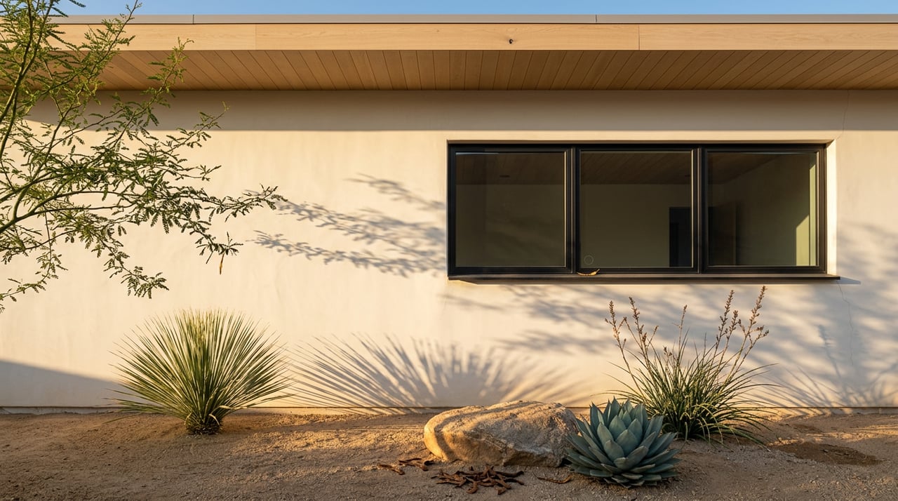
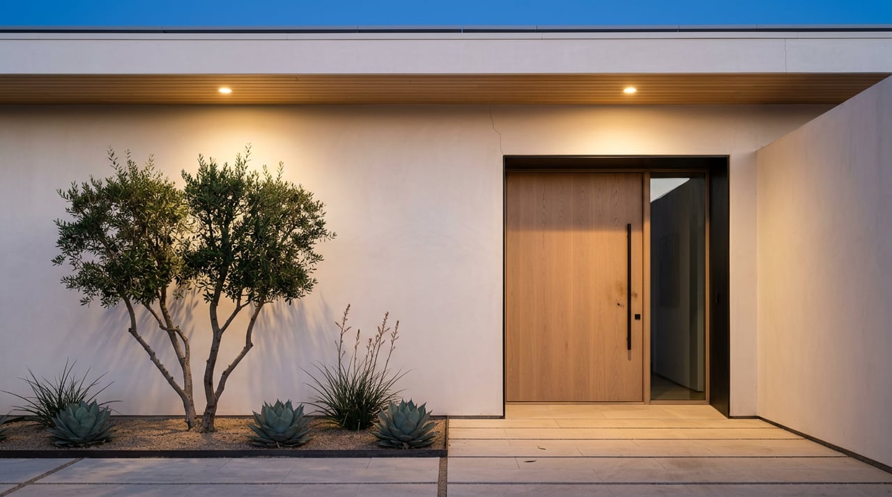
In Paradise Valley, many luxury homeowners favor sophisticated neutral palettes that complement expansive living spaces, abundant natural light, and seamless indoor-outdoor design.
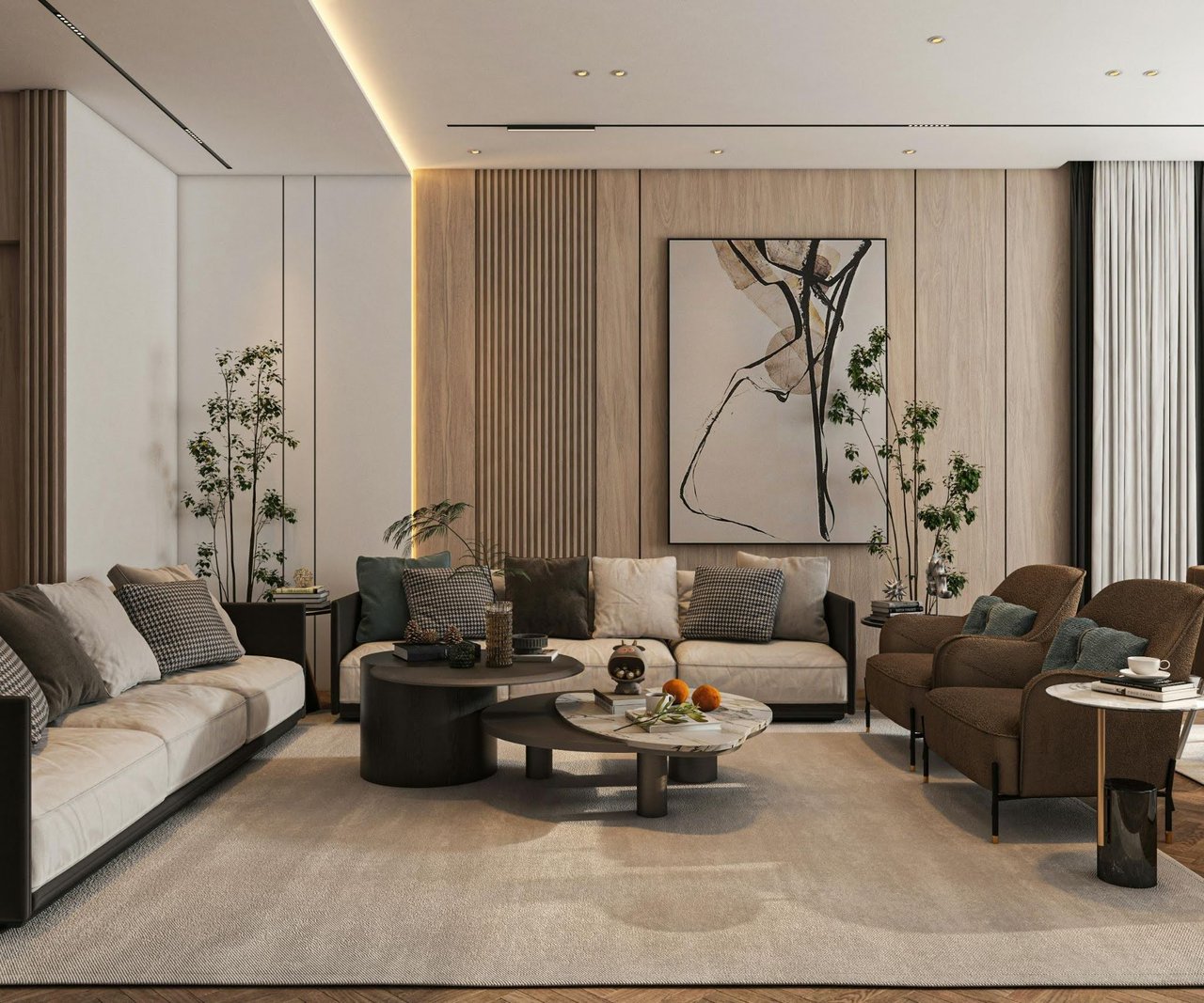
Choose Living Room Colors That Encourage Connection
Living rooms often function as gathering spaces where comfort and conversation take priority.
The right color palette can help create an inviting environment while supporting the home's overall design.
Effective Living Room Color Strategies
- Use warm neutral tones.
- Incorporate subtle accent colors.
- Consider natural lighting levels.
- Coordinate with flooring materials.
- Maintain visual continuity.
A balanced color palette helps create a comfortable and welcoming atmosphere.
Select Kitchen Colors That Feel Fresh and Timeless
Kitchens often combine practicality and design, making color selection especially important.
Timeless colors frequently offer greater longevity than highly trend-driven choices.
Popular Kitchen Paint Approaches
- Crisp whites.
- Soft warm neutrals.
- Light gray-greige blends.
- Earth-inspired hues.
- Coordinated cabinet and wall colors.
Choosing colors that complement countertops, cabinetry, and finishes helps create a cohesive appearance.
Create Relaxing Bedrooms With Softer Tones
Bedrooms are often intended to serve as restful retreats. Softer colors can help support a calm and relaxing environment.
Many homeowners gravitate toward palettes that promote comfort without feeling overly dramatic.
Bedroom Color Considerations
- Muted earth tones.
- Soft blues.
- Warm neutrals.
- Gentle greens.
- Layered tonal palettes.
These color families often contribute to a more restful atmosphere.
Use Bathrooms and Home Offices Strategically
Bathrooms and home offices are frequently overlooked when creating a whole-home color plan. However, thoughtful color choices can significantly improve both spaces.
Each room should support its intended purpose.
Effective Color Approaches
- Light tones for smaller bathrooms.
- Soft neutrals for spa-like environments.
- Calming greens and blues.
- Focus-enhancing office palettes.
- Consistent colors that support overall flow.
Creating intentional color schemes for these rooms can improve both functionality and visual consistency.
Create a Cohesive Color Story Throughout the Home
One of the most common mistakes homeowners make is selecting paint colors independently for each room without considering how the spaces connect.
A coordinated palette creates visual flow and helps the home feel more polished.
Benefits of a Cohesive Color Plan
- Better visual continuity.
- Improved architectural emphasis.
- Greater design consistency.
- Easier decorating decisions.
- More refined overall presentation.
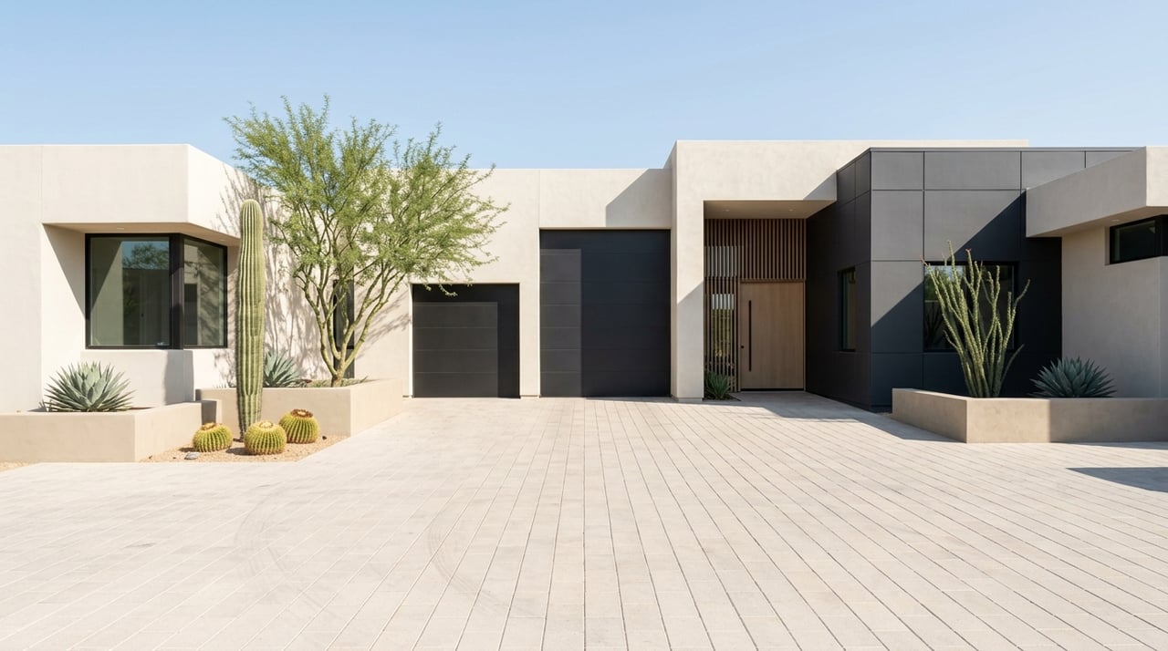
In many Paradise Valley homes, a cohesive color strategy helps highlight architectural features while supporting a sophisticated luxury aesthetic.
Why Paint Choices Matter
Paint is one of the most cost-effective ways to update a home's appearance. While paint alone does not determine market value, it can significantly influence presentation, design cohesion, and buyer perception.
Thoughtful color selections often help homes feel more current, well-maintained, and visually appealing.
Benefits of Strategic Paint Selection
- Enhanced visual appeal.
- Improved design cohesion.
- Stronger first impressions.
- Greater marketability.
- Updated overall appearance.
I often encourage homeowners to view paint as an opportunity to improve how a home is experienced rather than simply changing the color of a wall.
FAQs
Why does paint look different on my wall than it does on a sample card?
Lighting, surrounding materials, room orientation, and undertones can all affect how a paint color appears once applied to a larger surface.
What are paint undertones?
Undertones are subtle background hues within a paint color that influence its overall appearance. They often become more noticeable once paint is applied to a room.
Should every room in my home be painted the same color?
Not necessarily. Different rooms can benefit from different color palettes, but maintaining a cohesive overall scheme often creates better visual flow throughout the home.
Contact Me Today
Whether you're preparing a home for sale, planning a renovation, or simply looking to refresh your living space, thoughtful color selection can make a meaningful difference. Understanding how color psychology, lighting, and design principles work together can help you make choices that support both your lifestyle and your long-term goals.
Reach out to me, Clayton Wolfe, and I'll help you evaluate design opportunities, understand which updates may enhance your home's appeal, and make informed choices that complement the luxury lifestyle and architectural character often found in Paradise Valley.